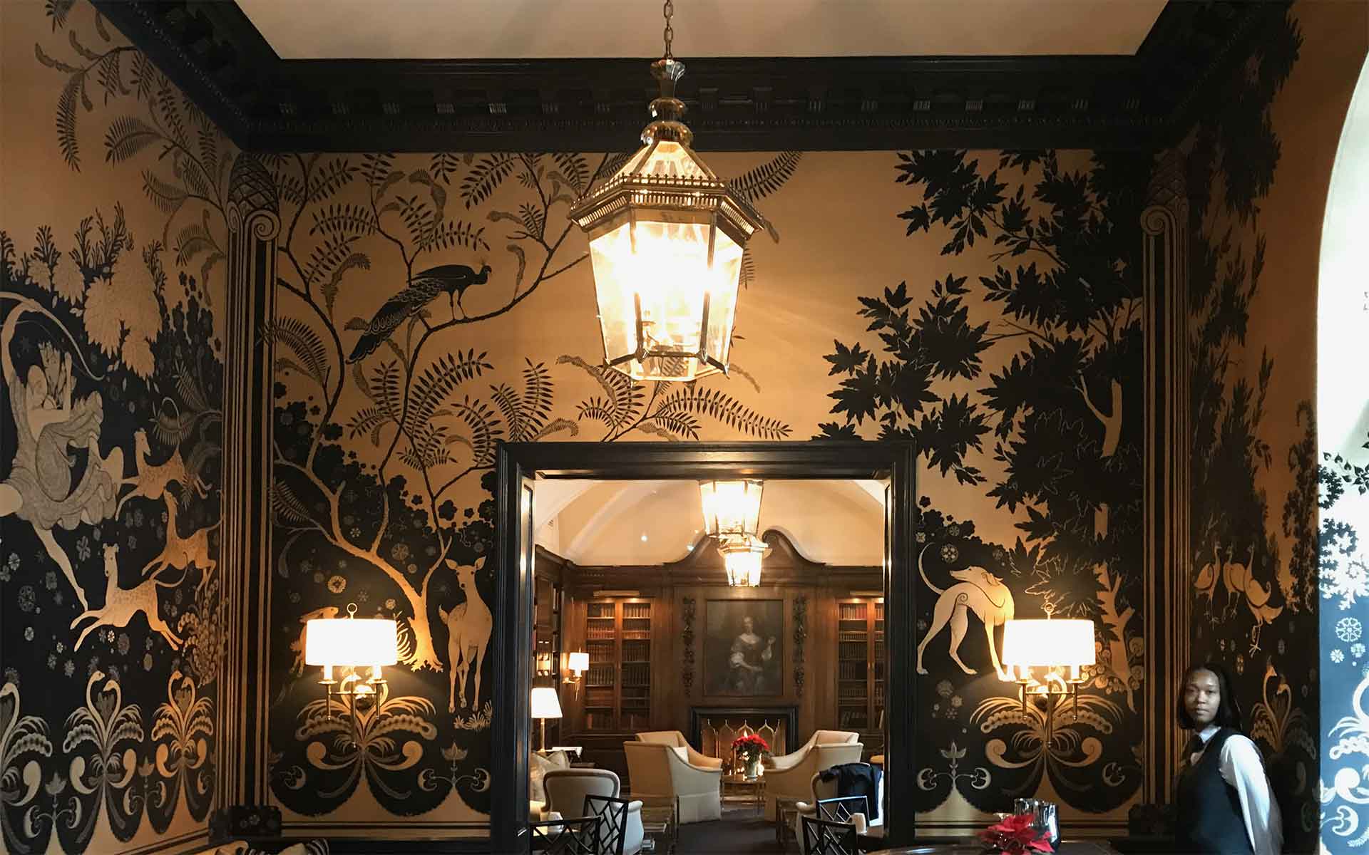
This week we want to share a few design-world insights on why matching or coordinating your commercial interior design with your brand identity can be subtle but very beneficial for brand positioning.
If you are already wondering what brand identity is – don’t worry, we’ll cover that as well as why it is important that it is well defined. You may also be wondering how to match your building’s interior design to your brand image and why that matters anyway. We’ll get to that too! By the end of this blog, you will be well suited to get an exciting plan going!
What Is Brand Identity?
Brand identity consists of all of your company’s visual elements – color, design, graphics, and the words used in your company name, as well as the overall tone these elements express. With a thoughtfully created visual language, brand identity can communicate company values as well as evoke emotion. Great examples of successful brand identity are Apple, McDonald’s, Coca-Cola, and Starbucks.
Why Is Brand Identity Important?
Brand identity is important for several reasons. First, when you creatively market with a strong brand identity design, you are bound to establish consistency and user recognition. Ultimately, the goal is to gain brand loyalty, recurring customers, and the ability to charge a higher premium for your goods and services.
Why would brand consistency increase your top-line revenue, you ask? When you showcase an organized and well thought out approach to your brand, you show potential customers that you know what they want and how to provide quality service. Their initial impression of your professional brand conveys your experience and reliability. In addition, a strong brand identity makes you memorable and differentiates you from your competition.
Benefits of Matching Interior Design with Brand Identity
Matching your interior design with your brand identity may sound daunting but it can be done simply and effectively by breaking it into a few categories.
First, it allows you to convey your company’s mission and values by means of your brand colors and design, as well as through the use and placement of messaging throughout your commercial space.
Let’s look at Apple as an example. Their logo and color scheme are simple: an apple combined with black and white. The interior design of its stores is minimalistic and lacks colors. This allows for the focus to be on their product and their customer service. Clean lines and no fussy extras speak to our subconscious: a quality product that is better than the competitor. Arguably, there are products out there that are as technologically sound as Apple products, but Apple matches their interior so well to their brand identity, that they blow the competition out of the water.

