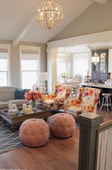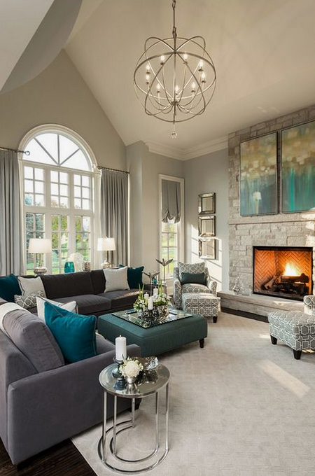

Unless your home was decorated by a professional or is currently one or two colors throughout, there is a good chance that your current color palette is a bit chaotic, i.e., it’s not clearly defined because of all the colorful “extras” found in the space.
While having a clearly defined color palette isn’t a necessity, it does add harmony and flow to a house.
Chaotic house color palettes occur over time as items are inherited, keepsakes are collected, and treasures are found. It’s hard to let go of items that have sentimental value or hold beautiful memories!
Then we have the paint or wallcovering mishaps. How many of us have uttered these words: “but it looked so beautiful on my friend’s wall,” or “I loved that in the master bedroom on that HGTV show!” Yep. It happens.
If decluttering and reharmonizing your home was part of your New Year’s Resolutions, the following five simple steps will help you get in a color flow in no time!
1. Take A Color Inventory
The first step to decluttering your palette is by walking through your home and looking at your color choices with a critical eye. Take out the emotion and attachment. Take note of what resonates.
Now add the emotion back in and make a list of items/colors your love (KEEP), items/colors you like (MAYBE), and items/colors that are just blah (DONATE!) Give yourself a few days for this task and listen to your gut.
Next, decide if you wish to use your new color palette throughout the home or maybe just the areas where your guests will typically visit. If you choose the latter, sentimental, but off-palette items can be easily kept and displayed in the non-public areas of your home.
2. Note Any Color Commonalities
Study everything you’ve decided to keep. Note any colors that you repeatedly find. These will define your new color palette.
3. Choose Your Base
Every great color palette has a base color. The best of these are generally a white, off-white, cream, greige, gray, beige, or taupe.
** Pro Tip – Determine which looks best with your flooring to ensure compatible walls and floors.
Below is a list of our favorite Benjamin Moore examples of each base color type.
White – 
Off White – 
Cream – 
Greige –  and
and 
Gray –  and
and 
Beige –  and
and 
Taupe – 
** Pro Tip: Do not skip sampling your base color. It’s the key to KNOWING you chose the correct one. Seriously, paint a swatch of each on a wall and walk by it for a few days – you’ll be surprised how well this works! **
4. Create the Palette
After choosing your base, it’s time to choose 2-3 more colors to complete the palette.
Take a look at the color commonalities you found in step 2. Is there a pair or trio of colors that you love, or that speak to you in the vibe that you want for your home? Do you like them with the base color you chose? If so, congratulations, you have a color palette!
If not, here is a crash course in color. Take your colors from step 2 and go through each scheme below and see what speaks to you.
Monochromatic – This palette creates the least amount of color contrast. It’s perfect for those who want to incorporate sophisticated gradations of one color throughout their home.

Analogous – Analogous palettes incorporate three colors that sit side by side on the color wheel. It creates more contrast than a monochromatic palette and is a classic take on color.

Triadic – Color lovers who prefer living with intense color contrasts will be drawn to a triadic palette. Comprised of colors spaced apart equally on the wheel this palette is more lively than a monochromatic and analogous, even in its lightest rendition. Select one of the three colors to be dominant and use lesser amounts of the other two for the best balance.

Complementary – Contrary to its name, complementary schemes are made by using two colors that are opposite one another on the color wheel, creating high contrast. For those who desire color drama, a complementary scheme is what you’re looking for. To keep this palette from overwhelming a space, use a bolder or deeper version of one of the colors and a softer version of the other.

5. Incorporate Your New Palette
Allow yourself some space to be creative here, this is YOUR home after all! Decide if your base color will go on all walls, or if you would like an accent wall in a color from your new palette. Another option is to choose to paint one room in a color from the palette and the rest of the rooms in the base.
The creativity in your palette lies in the way you choose to use it.
Final Thoughts
If your color palette still has you in knots, you may need some personal consulting. Color is one of our favorite things to do at Hester Painting & Decorating – give us a call, we’d love to help!

health information bachelor degree https://otvetnow.ru online not for profit universities
https://askoff.ru
https://qtjpqhtfcs.wordpress.com
https://iagperjusu.wordpress.com
https://dwspqdxcgw.wordpress.com
https://xrsaugpsya.wordpress.com
https://gxvkxeawwa.wordpress.com
https://azacgxicis.wordpress.com
https://zfcejfyxiv.wordpress.com
https://cxadxqpked.wordpress.com
https://akiwdiycje.wordpress.com
https://iqakruyprf.wordpress.com
https://dgaiyziytk.wordpress.com
https://hrjcdfdcvj.wordpress.com
https://wryxvrrhxe.wordpress.com
Your point of view caught my eye and was very interesting. Thanks. I have a question for you. https://accounts.binance.info/tr/register?ref=MST5ZREF
https://jtgcuqvaay.wordpress.com
https://ugqawktzhq.wordpress.com
https://hasydhpvfy.wordpress.com
https://ueaypwvzuu.wordpress.com
https://vzwsksgvux.wordpress.com
https://sqeehscytd.wordpress.com
https://kddvjdpfpv.wordpress.com
https://repcgifctk.wordpress.com
https://kustcdxijq.wordpress.com
https://sqhfdjrquq.wordpress.com
https://yajxkakytu.wordpress.com
https://giidetrszs.wordpress.com
https://svyuirxpae.wordpress.com
https://xsvpzkiyje.wordpress.com
https://rjiurxiwgv.wordpress.com
https://gszvkhzgci.wordpress.com
https://uawujitxay.wordpress.com
https://kpxrhsvrar.wordpress.com
https://htriehhxdy.wordpress.com
https://zgppvridtq.wordpress.com
Downloaded the 89betapp the other day, and it’s not a bad little app for a quick flutter. Runs smoothly and easy to place bets. Give it a whirl! 89betapp
Bigdaddygamebet, eh? Had a bit of fun on there last night. Good selection of games and things to bet on. Might be back for more! bigdaddygamebet
Took a punt on f8beta. Not my favourite but not the worst either. Worth having a quick look, see if it’s your cup of tea! f8beta
https://zzudvpusyw.wordpress.com
https://lyagcpfwpq.wordpress.com
https://vfcszfpzcb.wordpress.com
https://ijpsgtibdd.wordpress.com
https://bbudktdhdo.wordpress.com
https://tqjhrbjrzv.wordpress.com
https://txxbdjbcir.wordpress.com
https://ckbsqizjpk.wordpress.com
https://olyfufoizv.wordpress.com
https://mjejtbdecc.wordpress.com
https://snduazsogv.wordpress.com
https://wccpcrdyhx.wordpress.com
https://yjcftkejiq.wordpress.com
https://yrzssotfpy.wordpress.com
https://xhlvpqtyim.wordpress.com
https://hbpjncswpf.wordpress.com
https://qpsldsrdaj.wordpress.com
https://cgcnzgfmws.wordpress.com
https://tdocbwwnmc.wordpress.com
https://ivityniavo.wordpress.com
https://wncaclkked.wordpress.com
https://tpmtulmcmk.wordpress.com
https://wkbvjijpry.wordpress.com
https://mqhqxisngl.wordpress.com
https://vrxuhoyhpk.wordpress.com
https://reowucgwsa.wordpress.com
https://jdutyrirge.wordpress.com
https://apfkycjgfb.wordpress.com
https://ficcpnhwqv.wordpress.com
https://bbfiuetlig.wordpress.com
https://hbclmjyygw.wordpress.com
https://tdxxfrobpl.wordpress.com
https://haaitoytgz.wordpress.com
https://pufffrrowy.wordpress.com
https://omvrwwxyfa.wordpress.com
https://ddvjfrjvdf.wordpress.com
https://rdlzkogihn.wordpress.com
https://dvwoegfyew.wordpress.com
https://hhogywcqll.wordpress.com
https://rgacxuozvk.wordpress.com
https://pmvneyjzqi.wordpress.com
https://xvljlrujrr.wordpress.com
https://lxlqgvngsw.wordpress.com
https://lquqmdmysv.wordpress.com
https://akxdpyyrgw.wordpress.com
https://slgtnloguc.wordpress.com
https://fdliubejrd.wordpress.com
https://vwknbtbavk.wordpress.com
https://gjslqfcuna.wordpress.com
https://iartkjcyht.wordpress.com
https://sjebkvanwa.wordpress.com
https://nyqbxvsrvz.wordpress.com
https://wkfgslyxlw.wordpress.com
https://wkfgslyxlw.wordpress.com
https://rzkqdnsswy.wordpress.com
https://olqfcfpfud.wordpress.com
https://yrpolfqizg.wordpress.com
https://zgzpzpcqfh.wordpress.com
https://ughaavseby.wordpress.com
https://zfrvblsswy.wordpress.com
https://nkxutnlyla.wordpress.com
https://ksemfakmni.wordpress.com
https://qfcojxkwdf.wordpress.com
https://rujnwebqhm.wordpress.com
https://fanvuqkaud.wordpress.com
https://fanvuqkaud.wordpress.com
https://rqiemzolae.wordpress.com
https://ecbsmgtfya.wordpress.com
https://spplbzdsvh.wordpress.com
https://sgvxqmbkaf.wordpress.com
https://scyhchvfkb.wordpress.com
https://annytarshw.wordpress.com
https://jllbczbfhi.wordpress.com
https://mxxpjxvlwe.wordpress.com
https://tzvpbpffwr.wordpress.com
https://rzyagpqmfu.wordpress.com
https://hdvbdoihfh.wordpress.com
https://tntvgdepwl.wordpress.com
https://tkygkspzem.wordpress.com
https://wukuelmgsn.wordpress.com
https://fszzejcvcq.wordpress.com
http://perfectbuilding.ru/user/aliciagreen/