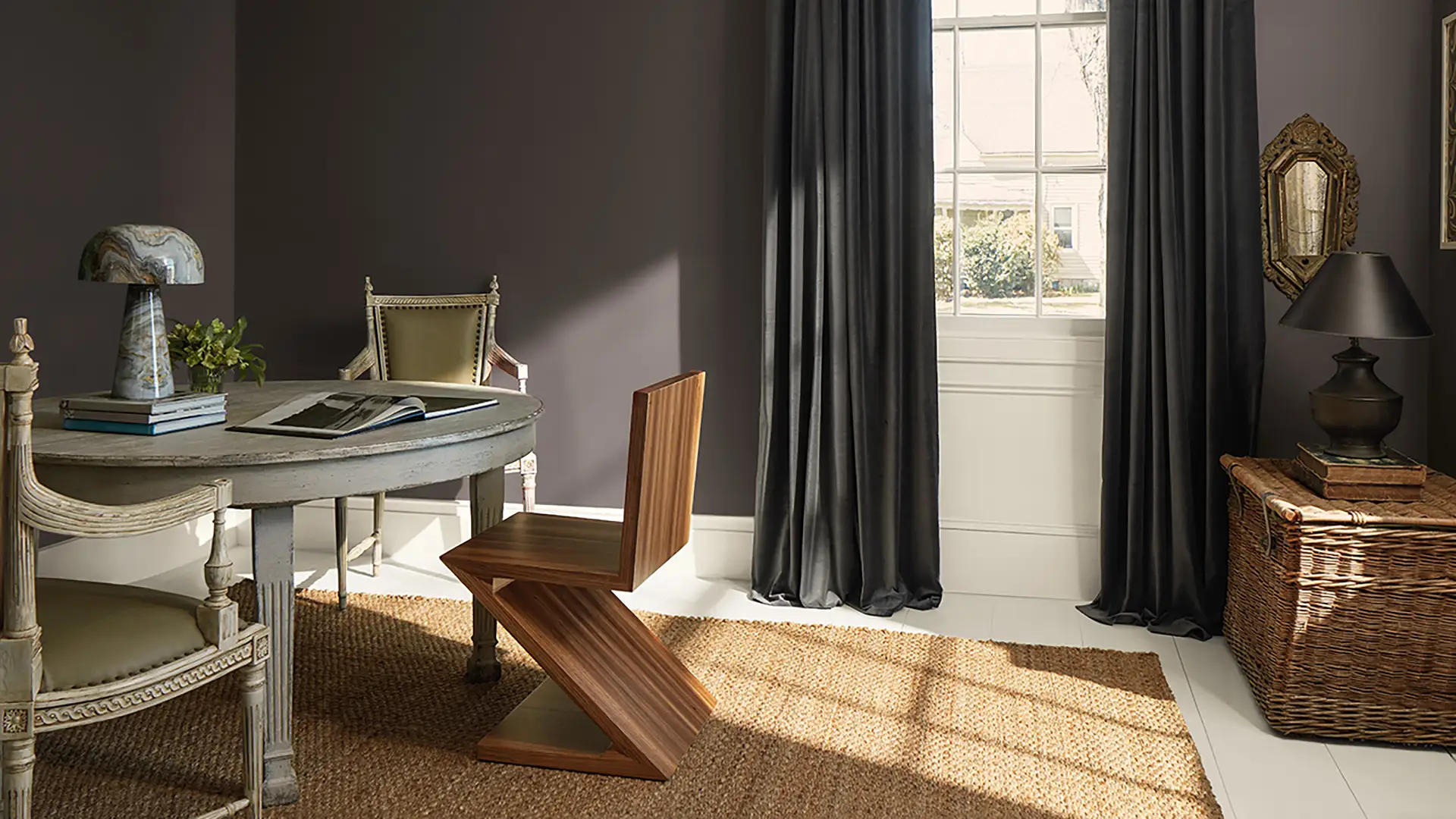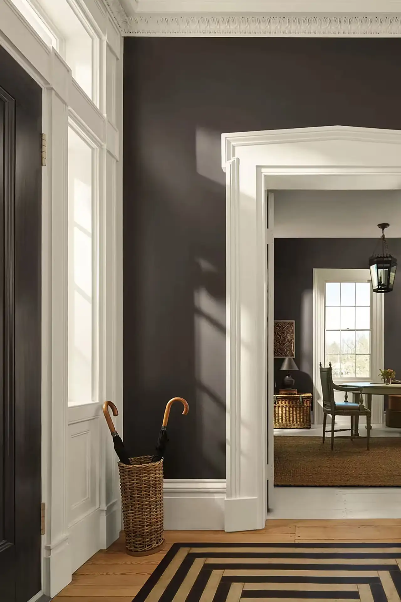
We all need deep comfort right now. Enter the shift in color trends for 2026. With the reveal of Benjamin Moore’s palette, especially its official color of the year, Silhouette AF‑655, we’re seeing a move away from trendy toward enduring sophistication. In a world that feels louder by the day, this hue invites us to slow down, and with a deep breath, root our spaces (and perhaps our lives) in intention and quiet confidence.
What the Color Says
Silhouette AF-655 is described by Benjamin Moore as “a distinctive color that weaves luxurious burnt umber with delicate notes of charcoal.” (Benjamin Moore) With a Light Reflectance Value (LRV) of just 10.18, it’s undeniably rich and substantial. (Benjamin Moore)
Here’s what stands out:
- Sophistication rooted in warmth. The blend of deep espresso with charcoal undertones gives Silhouette a grounded elegance. It’s not a trendy bold color; it’s more like a well-tailored blazer in paint form. As Andrea Magno (Benjamin Moore’s Director of Color Marketing & Design) put it:
“Silhouette … weaved a narrative of enduring style and grace, inspired by the modern take on classical suiting.” (Benjamin Moore) - An alternative to black or deep grey. The brown family is re-emerging as a go-to for depth and neutrality, with more warmth and an inviting personality.
- Layered, not loud. The color palette suggests we’re moving past micro-trends and toward colors that will last the test of time. Layers matter. Details matter. (Wallpaper*)
Meet the 2026 Palette
Benjamin Moore’s Color Trends 2026 consists of eight hues:
What do these colors offer when considered together:
- Balance of depth and light. Some colors are mid-tones or deeper (Silhouette, Narragansett Green), others are lighter and airier (Swiss Coffee), so you can mix and match.
- A nod to craft and detail. The palette draws on rich materials, subtle textures, and a sense of layering, just as you might layer fabrics and textures when building an outfit.
- Versatility across architecture. Whether you have a traditional home, modern space, or something in between, the palette allows for nuance without feeling overpowering.
How to Use Silhouette (and the Palette)
Here are some ways you might incorporate Silhouette AF-655 and its accompanying palette into your space.

1. Accent Wall or Statement Ceiling
Given its low LRV, covering most surfaces in Silhouette might feel heavy, but using it as an accent creates drama and depth. For example: a dining room wall, a built-in bookshelf, or a ceiling in a cozy study. The intent: a focal point with warmth and draw.
2. Trim, Doors or Built-Ins
Instead of white trim everywhere, consider painting doors or built-ins in Silhouette, paired with walls in a lighter companion shade like Swiss Coffee. This gives a layered look, grounding the space without making it feel dark. (Color Concierge)
3. Full Room Drench on Purpose
If you have good lighting and want a dramatic effect, drenching a smaller space (a powder room or reading nook) with Silhouette can feel enveloping and luxurious. The trick: keep the trim or ceiling in a lighter tone so the room still feels open.
4. Pairing with the Palette
- Combine Silhouette with Sherwood Tan or Southwest Pottery for warm, earthy pairings.
- Use Narragansett Green as a contrasting mid-tone that still sits in the sophisticated lane.
- Layer in Batik or First Crush for unexpected pops of softness or color.
- Let Swiss Coffee act as the versatile neutral backdrop.
Closing Thoughts
If you’re considering refreshing a space—maybe your media room, home office, or a place where you reflect and create—Hester Painting & Decorating can help you bring your vision to life. With Benjamin Moore’s Silhouette AF-655 and its refined palette, you’ll achieve a sophisticated yet comforting look. It’s not about chasing trends, but about choosing a color direction that supports you and your space for the long term.

Hello https://is.gd/tvHMGJ
AI Girls Video
Invite your network, boost your income—sign up for our affiliate program now!
hu0bzd
Be rewarded for every click—join our affiliate program today!
Share your link, earn rewards—sign up for our affiliate program!
Promote, refer, earn—join our affiliate program now!
Invite your network, boost your income—sign up for our affiliate program now!
https://askoff.ru
https://asklong.ru
how to measure social media success https://otvetnow.ru dc public library catalog
Boost your profits with our affiliate program—apply today!
Turn referrals into revenue—sign up for our affiliate program today!
bsn nursing scholarships https://otvetnow.ru td small business loan
Join our affiliate family and watch your profits soar—sign up today!
Earn big by sharing our offers—become an affiliate today!
7rwl5u
Share your link and rake in rewards—join our affiliate team!
https://askoff.ru
Share our offers and watch your wallet grow—become an affiliate!
la8zqg
https://qtjpqhtfcs.wordpress.com
https://iagperjusu.wordpress.com
https://iagperjusu.wordpress.com
https://dwspqdxcgw.wordpress.com
https://dwspqdxcgw.wordpress.com
https://xrsaugpsya.wordpress.com
https://xrsaugpsya.wordpress.com
https://gxvkxeawwa.wordpress.com
https://gxvkxeawwa.wordpress.com
https://azacgxicis.wordpress.com
https://azacgxicis.wordpress.com
https://zfcejfyxiv.wordpress.com
https://zfcejfyxiv.wordpress.com
https://cxadxqpked.wordpress.com
https://cxadxqpked.wordpress.com
https://akiwdiycje.wordpress.com
96hv7v
https://akiwdiycje.wordpress.com
https://iqakruyprf.wordpress.com
https://iqakruyprf.wordpress.com
https://dgaiyziytk.wordpress.com
https://dgaiyziytk.wordpress.com
https://hrjcdfdcvj.wordpress.com
https://wryxvrrhxe.wordpress.com
https://wryxvrrhxe.wordpress.com
https://thfdcufqah.wordpress.com
Earn recurring commissions with each referral—enroll today!
Start sharing, start earning—become our affiliate today!
f0fzae
Be rewarded for every click—join our affiliate program today!
Refer customers, collect commissions—join our affiliate program!
52nwtl
Earn passive income on autopilot—become our affiliate!
Boost your profits with our affiliate program—apply today!
Monetize your audience with our high-converting offers—apply today!
Turn your traffic into cash—join our affiliate program!
Boost your earnings effortlessly—become our affiliate!
Promote, refer, earn—join our affiliate program now!
Maximize your earnings with top-tier offers—apply now!
Partner with us and earn recurring commissions—join the affiliate program!
Monetize your influence—become an affiliate today!
Become our partner now and start turning referrals into revenue!
Boost your income—enroll in our affiliate program today!
Invite your network, boost your income—sign up for our affiliate program now!
Start sharing, start earning—become our affiliate today!
Start earning on every sale—become our affiliate partner today!
https://jtgcuqvaay.wordpress.com
https://jtgcuqvaay.wordpress.com
https://ugqawktzhq.wordpress.com
https://ugqawktzhq.wordpress.com
https://hasydhpvfy.wordpress.com
https://hasydhpvfy.wordpress.com
https://ueaypwvzuu.wordpress.com
https://ueaypwvzuu.wordpress.com
https://vzwsksgvux.wordpress.com
https://vzwsksgvux.wordpress.com
https://sqeehscytd.wordpress.com
https://sqeehscytd.wordpress.com
https://kddvjdpfpv.wordpress.com
https://kddvjdpfpv.wordpress.com
https://repcgifctk.wordpress.com
https://repcgifctk.wordpress.com
https://kustcdxijq.wordpress.com
https://kustcdxijq.wordpress.com
https://sqhfdjrquq.wordpress.com
https://sqhfdjrquq.wordpress.com
https://yajxkakytu.wordpress.com
https://yajxkakytu.wordpress.com
https://giidetrszs.wordpress.com
https://giidetrszs.wordpress.com
https://svyuirxpae.wordpress.com
https://xsvpzkiyje.wordpress.com
https://xsvpzkiyje.wordpress.com
https://rjiurxiwgv.wordpress.com
https://rjiurxiwgv.wordpress.com
https://gszvkhzgci.wordpress.com
https://gszvkhzgci.wordpress.com
https://uawujitxay.wordpress.com
https://uawujitxay.wordpress.com
https://kpxrhsvrar.wordpress.com
https://kpxrhsvrar.wordpress.com
https://htriehhxdy.wordpress.com
https://htriehhxdy.wordpress.com
https://zgppvridtq.wordpress.com
https://zgppvridtq.wordpress.com
Join our affiliate program today and earn generous commissions!
Join our affiliate program today and earn generous commissions!
Wow that was unusual. I just wrote an extremely long comment but after I clicked submit my comment
didn’t appear. Grrrr… well I’m not writing all that over again. Anyways, just wanted to say excellent blog!
Join our affiliate program today and start earning up to 30% commission—sign up now!
Start earning on every sale—become our affiliate partner today!
Tap into a new revenue stream—become an affiliate partner!
Start earning instantly—become our affiliate and earn on every sale!
Sign up for our affiliate program and watch your earnings grow!
Earn recurring commissions with each referral—enroll today!
Refer and earn up to 50% commission—join now!
Join our affiliate program and watch your earnings skyrocket—sign up now!
Drive sales and watch your affiliate earnings soar!
Start profiting from your traffic—sign up today!
Start earning passive income—join our affiliate network today!
https://zzudvpusyw.wordpress.com
https://zzudvpusyw.wordpress.com
https://lyagcpfwpq.wordpress.com
https://lyagcpfwpq.wordpress.com
https://vfcszfpzcb.wordpress.com
https://vfcszfpzcb.wordpress.com
https://ijpsgtibdd.wordpress.com
https://ijpsgtibdd.wordpress.com
https://bbudktdhdo.wordpress.com
https://bbudktdhdo.wordpress.com
https://tqjhrbjrzv.wordpress.com
https://tqjhrbjrzv.wordpress.com
https://txxbdjbcir.wordpress.com
https://txxbdjbcir.wordpress.com
https://ckbsqizjpk.wordpress.com
https://ckbsqizjpk.wordpress.com
https://olyfufoizv.wordpress.com
https://olyfufoizv.wordpress.com
https://mjejtbdecc.wordpress.com
https://mjejtbdecc.wordpress.com
https://snduazsogv.wordpress.com
https://wccpcrdyhx.wordpress.com
https://wccpcrdyhx.wordpress.com
https://yjcftkejiq.wordpress.com
https://qwofcxhwfl.wordpress.com
https://qwofcxhwfl.wordpress.com
https://yrzssotfpy.wordpress.com
https://yrzssotfpy.wordpress.com
Refer friends and colleagues—get paid for every signup!
https://xhlvpqtyim.wordpress.com
Become our partner and turn referrals into revenue—join now!
https://xhlvpqtyim.wordpress.com
https://hbpjncswpf.wordpress.com
https://hbpjncswpf.wordpress.com
https://stmwxxciro.wordpress.com
https://qpsldsrdaj.wordpress.com
https://cgcnzgfmws.wordpress.com
https://cgcnzgfmws.wordpress.com
https://tdocbwwnmc.wordpress.com
https://tdocbwwnmc.wordpress.com
https://ivityniavo.wordpress.com
https://ivityniavo.wordpress.com
https://wncaclkked.wordpress.com
https://wncaclkked.wordpress.com
https://tpmtulmcmk.wordpress.com
https://tpmtulmcmk.wordpress.com
https://wkbvjijpry.wordpress.com
https://mqhqxisngl.wordpress.com
https://mqhqxisngl.wordpress.com
https://vrxuhoyhpk.wordpress.com
https://vrxuhoyhpk.wordpress.com
https://reowucgwsa.wordpress.com
https://reowucgwsa.wordpress.com
https://jdutyrirge.wordpress.com
https://jdutyrirge.wordpress.com
https://apfkycjgfb.wordpress.com
https://apfkycjgfb.wordpress.com
https://ficcpnhwqv.wordpress.com
https://ficcpnhwqv.wordpress.com
https://bbfiuetlig.wordpress.com
https://bbfiuetlig.wordpress.com
https://hbclmjyygw.wordpress.com
https://hbclmjyygw.wordpress.com
https://tdxxfrobpl.wordpress.com
https://tdxxfrobpl.wordpress.com
https://haaitoytgz.wordpress.com
https://haaitoytgz.wordpress.com
https://pufffrrowy.wordpress.com
https://pufffrrowy.wordpress.com
https://omvrwwxyfa.wordpress.com
https://omvrwwxyfa.wordpress.com
https://ddvjfrjvdf.wordpress.com
https://rdlzkogihn.wordpress.com
https://rdlzkogihn.wordpress.com
https://dvwoegfyew.wordpress.com
https://dvwoegfyew.wordpress.com
https://hhogywcqll.wordpress.com
https://hhogywcqll.wordpress.com
Start profiting from your network—sign up today!
https://rgacxuozvk.wordpress.com
https://rgacxuozvk.wordpress.com
https://pmvneyjzqi.wordpress.com
Become our partner now and start turning referrals into revenue!
https://pmvneyjzqi.wordpress.com
https://xvljlrujrr.wordpress.com
https://xvljlrujrr.wordpress.com
https://lxlqgvngsw.wordpress.com
https://lxlqgvngsw.wordpress.com
https://lquqmdmysv.wordpress.com
https://lquqmdmysv.wordpress.com
https://akxdpyyrgw.wordpress.com
https://akxdpyyrgw.wordpress.com
https://slgtnloguc.wordpress.com
https://slgtnloguc.wordpress.com
https://fdliubejrd.wordpress.com
https://fdliubejrd.wordpress.com
Share our products and watch your earnings grow—join our affiliate program!
https://vwknbtbavk.wordpress.com
https://vwknbtbavk.wordpress.com
https://gjslqfcuna.wordpress.com
https://gjslqfcuna.wordpress.com
https://iartkjcyht.wordpress.com
https://iartkjcyht.wordpress.com
https://sjebkvanwa.wordpress.com
https://sjebkvanwa.wordpress.com
Partner with us and enjoy high payouts—apply now!
https://nyqbxvsrvz.wordpress.com
https://nyqbxvsrvz.wordpress.com
https://wkfgslyxlw.wordpress.com
https://wkfgslyxlw.wordpress.com
https://wkfgslyxlw.wordpress.com
https://wkfgslyxlw.wordpress.com
https://rzkqdnsswy.wordpress.com
https://rzkqdnsswy.wordpress.com
https://olqfcfpfud.wordpress.com
https://olqfcfpfud.wordpress.com
https://yrpolfqizg.wordpress.com
https://yrpolfqizg.wordpress.com
https://zgzpzpcqfh.wordpress.com
https://zgzpzpcqfh.wordpress.com
https://ughaavseby.wordpress.com
https://ughaavseby.wordpress.com
https://ughaavseby.wordpress.com
https://zfrvblsswy.wordpress.com
https://zfrvblsswy.wordpress.com
https://nkxutnlyla.wordpress.com
https://nkxutnlyla.wordpress.com
https://ksemfakmni.wordpress.com
https://ksemfakmni.wordpress.com
https://qfcojxkwdf.wordpress.com
https://qfcojxkwdf.wordpress.com
https://rujnwebqhm.wordpress.com
https://rujnwebqhm.wordpress.com
https://fanvuqkaud.wordpress.com
https://fanvuqkaud.wordpress.com
https://fanvuqkaud.wordpress.com
Share our products, reap the rewards—apply to our affiliate program!
https://rqiemzolae.wordpress.com
https://rqiemzolae.wordpress.com
https://ecbsmgtfya.wordpress.com
https://ecbsmgtfya.wordpress.com
https://spplbzdsvh.wordpress.com
https://spplbzdsvh.wordpress.com
Easy to log in to 2ez bet. A simple and fast log in is important to me. Give it a shot if you are looking for sports bets. 2ez bet log in.
Anyone know where I can find a safe spot to grab the S9 game apk download? Don’t want no viruses, ya feel me? s9 game apk download
Heard Playcity casino has a bono sin depósito! Free money to play? Yes, please! Going to check that out ASAP. Hoping for some beginner’s luck! Do not wait more and check this out! playcity casino bono sin depósito
https://sgvxqmbkaf.wordpress.com
https://sgvxqmbkaf.wordpress.com
https://scyhchvfkb.wordpress.com
https://scyhchvfkb.wordpress.com
https://annytarshw.wordpress.com
https://jllbczbfhi.wordpress.com
https://jllbczbfhi.wordpress.com
https://mxxpjxvlwe.wordpress.com
https://mxxpjxvlwe.wordpress.com
https://tzvpbpffwr.wordpress.com
https://rzyagpqmfu.wordpress.com
https://rzyagpqmfu.wordpress.com
https://hdvbdoihfh.wordpress.com
https://hdvbdoihfh.wordpress.com
https://tntvgdepwl.wordpress.com
https://tntvgdepwl.wordpress.com
https://tkygkspzem.wordpress.com
https://tkygkspzem.wordpress.com
https://wukuelmgsn.wordpress.com
https://wukuelmgsn.wordpress.com
https://fszzejcvcq.wordpress.com
https://fszzejcvcq.wordpress.com
http://perfectbuilding.ru/user/aliciagreen/
Hi there, just was aware of your weblog through Google, and located that it’s truly informative. I am going to watch out for brussels. I will be grateful in the event you continue this in future. A lot of folks shall be benefited out of your writing. Cheers!
I just added this webpage to my google reader, excellent stuff. Can’t get enough!
I’m really enjoying the theme/design of your blog. Do you ever run into any web browser compatibility issues? A couple of my blog readers have complained about my blog not operating correctly in Explorer but looks great in Opera. Do you have any tips to help fix this problem?